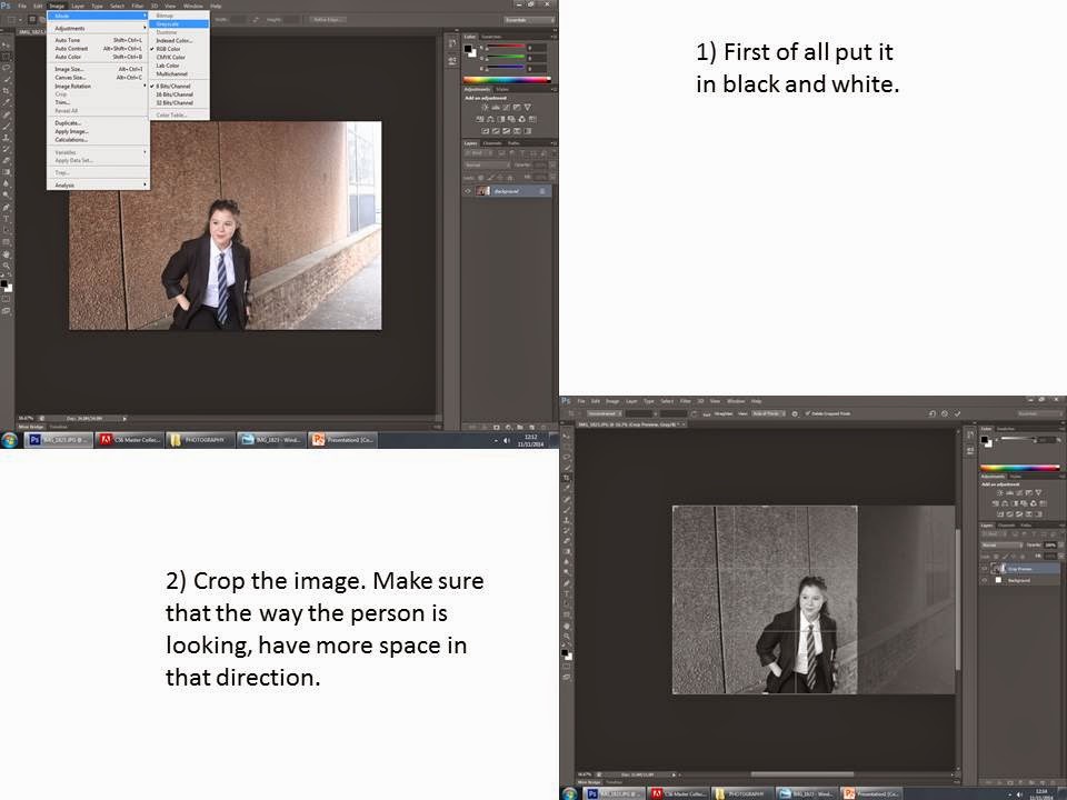
 Jesper Molin 'somebody or nobody'
This is an image of one of Jesper Molin art pieces. I like this art piece because it shows that no is perfect and that you have two sides of your face even if you don't see it straight away. Through out Molins work i think you can see that society view on true perfection is wrong because no one is perfect.
Where does Jesper Molin work?
Jasper Molin works in Sweden. He started photography when he was ten years when he got his first camera and ever since he as studied art and photography. Molin did a two year course on photography and art , he graduated in 2003 and started his first expedition. Before this he wrote a book called PALS , his first real art project in 1999.
How did he achieve his work and why?
As referred in the previous paragraph Jesper Molin has achieved his work by graduating at the art and photography school in Gothenburg for almost 2 years. Also his passion for art and photography has help him to, to achieve his dream and become ambitious.
Here is my take on Jesper Molin art work.
 Here you are seeing my take on the 'somebody or nobody'.
I have achieve these images by going on photo-shop. Whilst on photo-shop what i had to do was, first of all I selected half of the my image. Secondly I copy it then pasted it on to its self. Thirdly I had to move the one side of the face to the other so she had the right side on the left and the other way around.
Shadi Ghadirian ‘Like Everyday’
This is one of Ghadirian art pieces. In this art work she is showing the woman's role in a Islamic state. I like her art work because its not about focusing on a face there is a meaning behind it. The subject of the photo is the rubber glove. The yellow glove is the subject because its what the photographer wants you to look at the most and its that, that has all the meaning behind it. Shadi has used an abstract to make the yellow rubber glove to be the main object in the image.
Where does Shadi Ghadirian work?
Shadi Ghadirian works in Tehran , which is in Iran. Tehran in Iran is the country and place were she has grow up in and now works. Her art work is based of the Islamic culture and how a women is represented.
How does Ghadirian achieve her work and why?
She achieves her work by taking ordinary house hold object and using them as her tool of trade. By doing this it makes her art work really unique. She does this because she wants to challenge the ancient codes of the Shariah law.
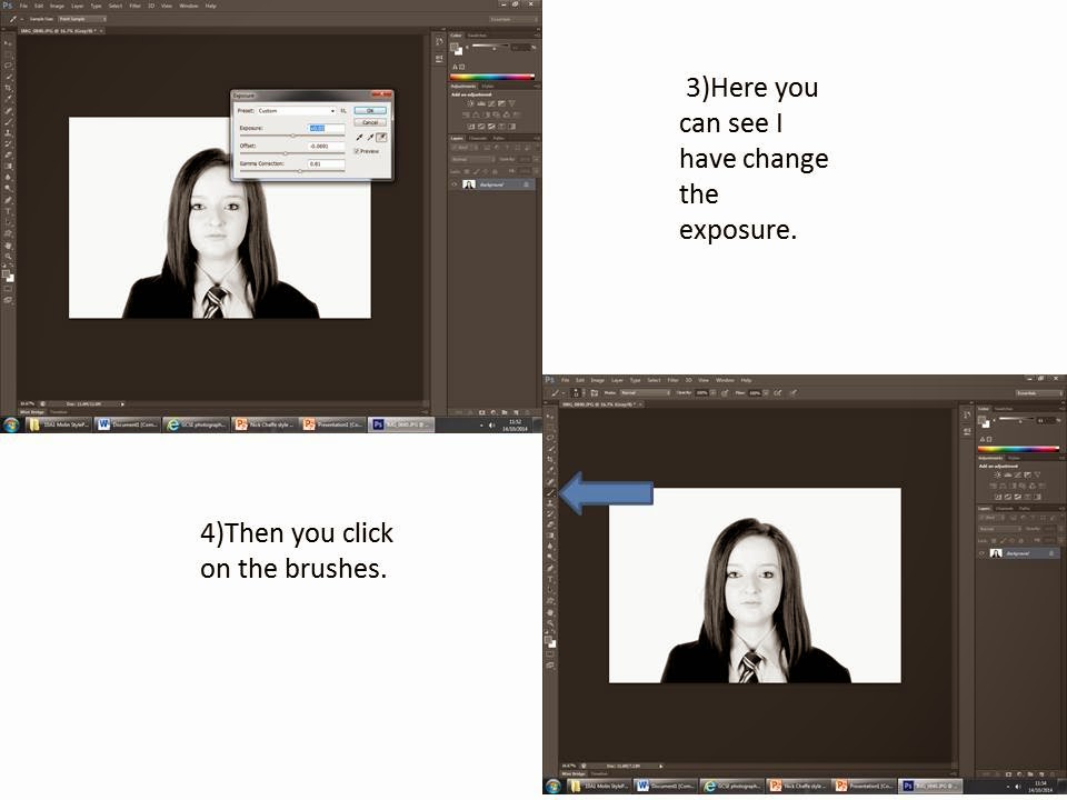
Here is my take on one of Shadi Ghadirian.
 This is my take on 'like every day'. I taken out something that represented my personality. I taken out my Ready Salted Crisp , because I love food. I directed one the other students in the class to take the photo while I was the model. In this photo you can see that I have change the exposure
so that the packet of crisps is now the subject of the photo.
This is my take on 'like every day'. I taken out something that represented my personality. I taken out my Ready Salted Crisp , because I love food. I directed one the other students in the class to take the photo while I was the model. In this photo you can see that I have change the exposure
so that the packet of crisps is now the subject of the photo.
Here is a photo of a Canon 450d.
 Here is a photo of a Canon 450d. This is the camera that I have used for all the photos I have taken, in the studio. The settings we used was, the shutter speed was 1/125, the aperture was f/11 and the ISO 200.
What is aperture and shutter speed?
Aperture.
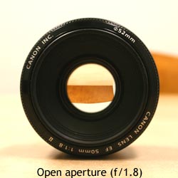
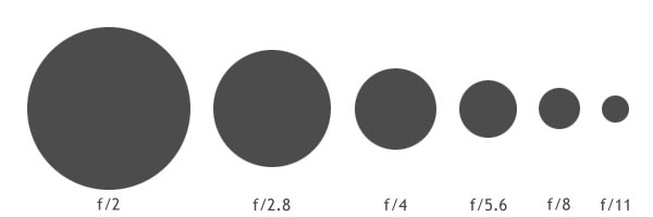
 This is a image of an open or large aperture. The smaller the number (e.g f/1.8) the bigger the open hole is and the more light aloud in the photo. That means when you take a photo using and open aperture, the subject of the image will stand out because the back ground will be out of focus.

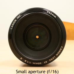
This is a image of a small aperture. The bigger the number (e.g f/16) the smaller the hole is and the little light aloud in the photo. That means that when you take a photo you can see the subject of the image and the background will not be out of focus .
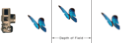
The image you can see here show you how the aperture changes from a large to a small.
Shutter Speed
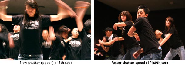
The three images above show you the affects what the timings of your shutter speed does to you photo.
Normally the camera works out the correct shutter but you can do it manually as well. This is the only number other than the aperture number. The shutter speed number looks and is written like a fraction (e.g 1/4000 ). In my photos I have been taking have had a shutter speed of 1/125. If you wanted to double the shutter speed it would let in twice the amount of light and if I was going to half it I would give me less the light in the photo. Also what is good about shutter speed is that you can either freeze motion using a fast shutter speed or you can capture movement using a slow shutter speed. Using the images below you can see the differences between the fast shutter speed and the low shutter speed with moving dancers.

Understanding of ISO.
ISO is one of the tree pillars of photography, the other two are shutter speed and the aperture. The ISO is the level of sensitive to the light your camera is. The lower the number is the lower sensitive it is to the light. Within your camera you have a component called 'image sensor or maybe just called 'sensor'. That is the most important part of the camera because it is responsible for gathering all the light, and taking that light and transforming it into the photo. When I was in the studio the ISO I used was 200.
 This image shows you the ISO and how clear it make the picture look when you use the light in the and sensitivity of your camera.
High key lighting studio
Here you can see a high key lighting studio.
Here is an other image of high key lighting studio. This image shows in a bit more detail how its set up.


.jpg)